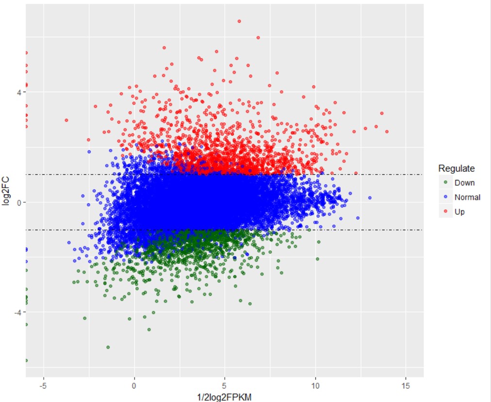
MA plot 绘图计算公式
MA图主要应用在基因组数据可视化方面,实现数据分布情况的展示。早期主要应用于DNA芯片数据,现在常用于高通量测序数据中基因差异表达分析结果的展示。
其计算公式如下:

M一般做Y轴,A一般做X轴。
M常对应差异表达分析获得的差异对比组之间基因表达变化log2FC
A可以利用差异对比组的FPKM进行计算,以R和G来表示差异对比组的话,可以取R组基因的平均FPKM和G组基因的平均FPKM进行计算。也包括多个R包可以实现MA图绘制:
affy (ma.plot, mva.pairs), limma (plotMA), marray (maPlot), and edgeR(maPlot)
原文参考维基百科:MA plot (点击进入页面)
##############
Microarray data is often normalized within arrays to control for systematic biases in dye coupling and hybridization efficiencies, as well as other technical biases in the DNA probes and the print tip used to spot the array.[3] By minimizing these systematic variations, true biological differences can be found. To determine whether normalization is needed, one can plot Cy5 (R) intensities against Cy3 (G) intensities and see whether the slope of the line is around 1. An improved method, which is basically a scaled, 45 degree rotation of the R vs. G plot is an MA-plot.[4] The MA-plot is a plot of the distribution of the red/green intensity ratio ('M') plotted by the average intensity ('A'). M and A are defined by the following equations.

M is, therefore, the binary logarithm of the intensity ratio (or difference between log intensities) and A is the average log intensity for a dot in the plot. MA plots are then used to visualize intensity-dependent ratio of raw microarray data (microarrays typically show a bias here, with higher A resulting in higher |M|, i.e. the brighter the spot the more likely an observed difference between sample and control). The MA plot uses M as the y-axis and A as the x-axis and gives a quick overview of the distribution of the data.
In many microarray gene expression experiments, an underlying assumption is that most of the genes would not see any change in their expression; therefore, the majority of the points on the y-axis (M) would be located at 0, since Log(1) is 0. If this is not the case, then a normalization method such as LOESS should be applied to the data before statistical analysis. (On the diagram below see the red line running below the zero mark before normalization, it should be straight. Since it is not straight, the data should be normalized. After being normalized, the red line is straight on the zero line and shows as pink/black.)
##################

相关课程:GEO芯片数据挖掘、GEO芯片数据标准化
更多生物信息课程:
1. 文章越来越难发?是你没发现新思路,基因家族分析发2-4分文章简单快速,学习链接:基因家族分析实操课程、基因家族文献思路解读
2. 转录组数据理解不深入?图表看不懂?点击链接学习深入解读数据结果文件,学习链接:转录组(有参)结果解读;转录组(无参)结果解读
3. 转录组数据深入挖掘技能-WGCNA,提升你的文章档次,学习链接:WGCNA-加权基因共表达网络分析
4. 转录组数据怎么挖掘?学习链接:转录组标准分析后的数据挖掘、转录组文献解读
5. 微生物16S/ITS/18S分析原理及结果解读、OTU网络图绘制、cytoscape与网络图绘制课程
6. 生物信息入门到精通必修基础课:linux系统使用、perl入门到精通、perl语言高级、R语言入门、R语言画图
7. 医学相关数据挖掘课程,不用做实验也能发文章:TCGA-差异基因分析、GEO芯片数据挖掘、GEO芯片数据标准化、GSEA富集分析课程、TCGA临床数据生存分析、TCGA-转录因子分析、TCGA-ceRNA调控网络分析
8.其他,二代测序转录组数据自主分析、NCBI数据上传、二代测序数据解读
- 发表于 2018-08-10 13:20
- 阅读 ( 12568 )
- 分类:R
你可能感兴趣的文章
- R语言如何绘制MA图 16641 浏览
